Another benefit of Responsive Web Design
Pretty much anybody who knows anything about web design these days ought to know what responsive web design is (I'm pretty new to the game and I know what it is). For those who don't know what responsive web design is, it's where you design a website in such a way that it automatically adjusts the layout based on the size of the surface it is drawn on. The idea is that the website will be fit for phone, tablet and desktop without having to redirect to a special "m.example.com" for mobile users.
To test responsiveness of a website, you don't have to break open your phone (although you could, and an easy way to do so would be to use my "brilliant" QR-This app). Rather, you can simply drag your browser window into the size of a phone screen and watch the magic happen.
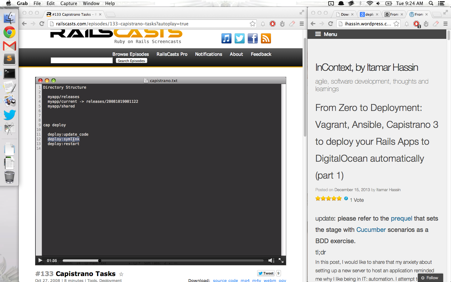
However, therein lies yet another use of responsive web design: being able to shrink browser windows to take up tiny portions of your desktop screen without sacrificing readability. The following screenshot demonstrates this amazingness:

I'm glad to see so many website are moving towards responsive web design (even Ubuntu's Unity 8 is bringing the notion to the desktop/homescreen of their upcoming releases). You should do it to.